AI-ready Design System, built with strategy
How I redesigned an entire platform in 3 months, where real user data and design criteria made the AI genuinely effective, not just fast.
Case Study
Finlink

Context and my role
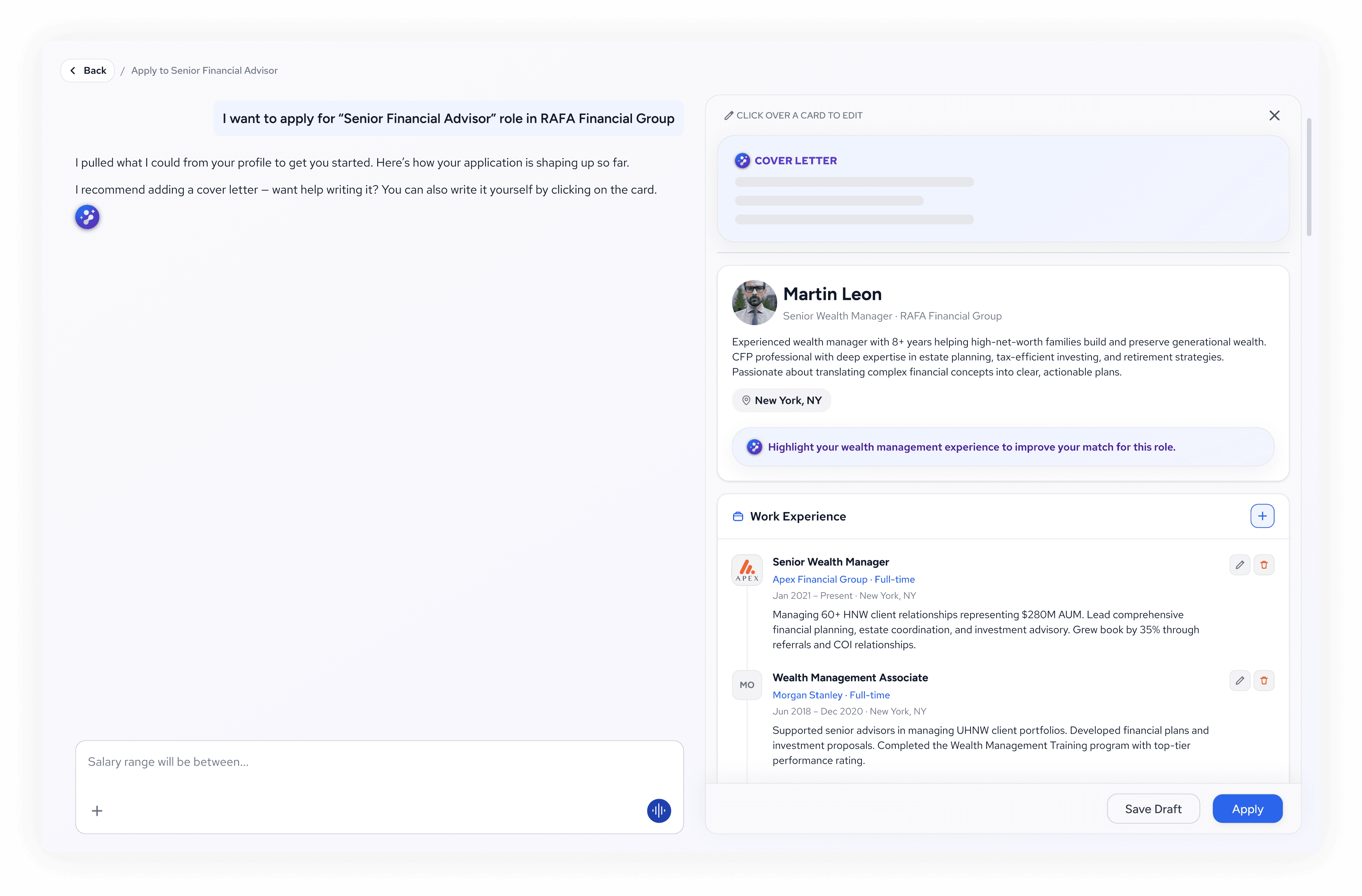
An existing platform with a loyal user base and a stable number of paid users, but frozen growth. Think of it as LinkedIn for Financial Advisors. They wanted to revamp the platform and bring in new technology to reach new audiences with a stronger product.
I was in charge of redesigning the entire platform, refreshing the brand, and proposing AI integrations across the user experience. It was a 3-month project, working closely with two developers and the Head of AI, and in direct conversation with stakeholders throughout.
In this case study, I'll walk you through how designing with and for AI, grounded in real user data and led by design criteria, let me move fast without ending up with a generic product, or losing the human touch.
Strategy: starting from real users
Before improving, you need to know what's working and what's not. I audited the existing platform and interviewed four real users to understand their behavior, goals, and pain points.
One thing came through immediately: the Information Architecture was a mess, and users couldn't find anything. So I rebuilt it around more intuitive navigation. That fixed the fundamentals, but for 2026 it wasn't enough on its own...
With LLMs now part of everyday life, users have come to expect search in plain language, so I proposed an AI-powered global search across the platform. Users can just ask the AI Agent for what they need, from a job that fits their profile, to a buyer for their practice, to events in their area. And for anyone who'd rather not, traditional navigation and search stay fully in place alongside it.
An AI-ready Design System
Because this was a short term, fast paced project, I made a strategic decision: while auditing and researching the current product, I also set the foundations of an AI-ready Design System, which kept growing as the redesign process advanced:
Structured guidelines the AI could follow: markdown docs split into the rules I wanted to keep (Guidelines.md), per-component guidance (components.md), and the available styles and how to use them (styles.md), with WCAG contrast compliance baked in.
A token foundation with primitive and semantic layers, the semantic layer named for meaning rather than appearance.
Every component structured cleanly, with Auto Layout, defined variants, and constraints.
I worked with Figma Make as my generative tool, feeding it all of this design system information and running it on Sonnet 4.6 and Opus 4.8. What I value about Make is that it lets me step in and edit the design manually whenever I need to.
Two of the biggest mistakes I've seen on projects that lean on GenAI are overly generic designs that aren't memorable, and teams that end up prisoners of a setup where every change burns through credits. Working in Figma let me avoid both: I could explore the visual identity and find creative solutions when the design called for it, while letting the AI carry the repetitive work, simple layouts, component variants, their states, etc.
From there, I used Figma MCP + Claude Code to get to code, which was reviewed and wired up by the full-stack developer in charge. The results held up because the foundation underneath was well built.
Conclusions
Creating an AI-ready Design System helped me accelerate design times, and keeping a strong focus on strategy ensured those designs would actually solve a problem. When done with design criteria, and not just for AI-FOMO, these models can make a project more effective without losing sight of the user experience.
If you want to know more about the features I planned and designed on this project, feel free to reach out for a meeting.
And now, everyone's favorite part of any case study: a bunch of screens…