Creating an intuitive AI powered ticker analysis
2024 | RAFA.AI

Introduction
RAFA is a B2C mobile app that uses AI to help investors analyze stocks, ETFs, and crypto. In this case study, I’ll walk you through one of my biggest challenges as RAFA’s Main Product Designer: designing the ticker pages from scratch, keeping the depth of information while making analysis more intuitive and less overwhelming.
Context
Our target users are experienced investors, but even experts shouldn’t face cognitive overload. The goal of this feature was to present valuable AI insights clearly while addressing the unique data needs of stocks, ETFs, and crypto.
Since RAFA was still in its early stages, I started from the data gathered from beta testers by our UX Researcher and also relied on best practices, stakeholder input, competitor analysis, and my experience with data-heavy products.
The Problem
The Solution
I decided to structure the entire section as modular cards that could be opened to reveal more information. This matched the style of the rest of the UI and, most importantly, ensured layout flexibility. Each card needed to display specific data, thorough enough to be useful but not overwhelming, and remain highly visual.
Ticker Analysis Page, accessing from Portfolios. Final design, recording from the live version.
This design features a set of cards that work together to give users valuable information about a ticker and help them take smart actions. I'll walk you through the design process behind two of them:
Analysts Opinions Card
Designed to help users understand analysts' opinions, projected target prices, and trend changes over time.

Final design. Analysts Opinions card inside the Ticker Analysis and it's open version.
For this one, the co-founder had some initial ideas sketched directly in code, a great starting point for understanding what he had in mind. We held a discovery meeting where I took notes, working to understand the problem this card was solving, what each graphic was trying to communicate, and how the industry typically presents that type of data.

My notes and references over his initial draft.
From that conversation, I identified the core value of this card:
Quickly assess market sentiment from analysts
Show trend changes (more buys or sells over time)
Compare current price vs. price targets
Use price targets to inform personal risk/reward strategies

Final version of the card.
To address those goals, I:
Divided the card into two sections: Analyst Ratings and Target Price, for easy visual scanning
For Analyst Ratings, I created a doughnut chart showing current opinions from strong buy to strong sell, with a short contextual explanation from our AI Agents
Under Target Price, I presented the range color-coded: red for the lowest, green for the highest
Like most cards in this design, this one includes an expanded drawer view. Here it features an extended timeline of Analyst Ratings over time, an AI Agent's take, and access to Learn articles, so even beginners can build real expertise.
Intrinsic Value Card
Analysts' price projections can help users decide when to enter or exit a position. But how do they know if that price is actually fair? Working with the co-founder, we designed a card that shows users how a ticker is valued intrinsically, using the Discounted Cash Flow model, and compares it against the current market price.

Card inside the Ticker Analysis and it's open version.
The design hinged on two key values: Market Price and Intrinsic Value. Their relationship produces three possible scenarios:
Market < Intrinsic → Undervalued
Market = Intrinsic → Fairly Valued
Market > Intrinsic → Overvalued
Instead of a generic "Intrinsic Value" title, I used that prime spot (the first thing users scan visually) to lead with meaning, using a title that directly communicates the state, like "Undervalued by 36.56%." I paired it with a range graphic that scales across the under- to overvalued spectrum, adds a visual reference for the impact of that percentage, and adapts to tickers at any price point.
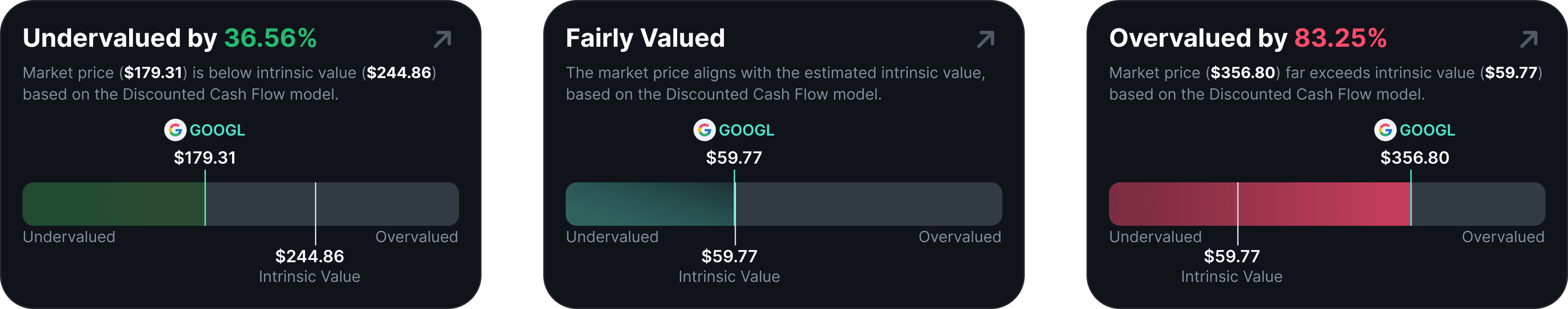
The expanded drawer adds Key Valuation Metrics for users who want the deeper context behind the number.
Results
This project was part of RAFA's V1 public release, following multiple alpha and beta stages. The new version had a strong impact on user engagement, with increases in both downloads and time spent in the app.
Users reported reducing their research time from 2-4 hours across different platforms to 15-30 minutes inside RAFA. We tracked interaction data to understand usage patterns, and the Ticker Analysis page quickly became the most visited feature, users spent about 80% of their in-app time there.
These early results validated the design direction and led to the next challenge: measuring specific in-page interactions and analyzing how users engaged with AI-driven conversations to uncover patterns in their investment behavior and keep improving the experience.