Designing a scalable loan referral experience
2020 | Properati Créditos | OLX
Introduction
Properati Créditos was a subdivision of Properati, focused on helping people buy homes through bank loans. Rather than lending directly, it partnered with local banks and real estate agents to create a smoother, less stressful buying experience.
Context
The product began as a small, highly manual MVP, with agents referring clients through emails and spreadsheets and the Operations Team handling each case individually. I joined to design the digital product and ended up creating a full experience that structured the service and improved communication across all parties involved.
The new system allowed each Loan Operations Specialist to handle five times more clients.
Research
I interviewed real estate agents working with Properati and buyers who had gone through the loan referral flow to better understand their motivations, fears, and needs. All participants were based in the product’s target markets: Ecuador, Colombia, and Peru.
Local bank data already pointed to two main buyer profiles: young couples purchasing their first home (homebuyers), and buyers over 35 looking for a second property as an investment (property investors).
To get a full picture, I also met with our Operations Team to understand their current workflow, their touchpoints with agents and buyers, as well as their main pain points and highlights.
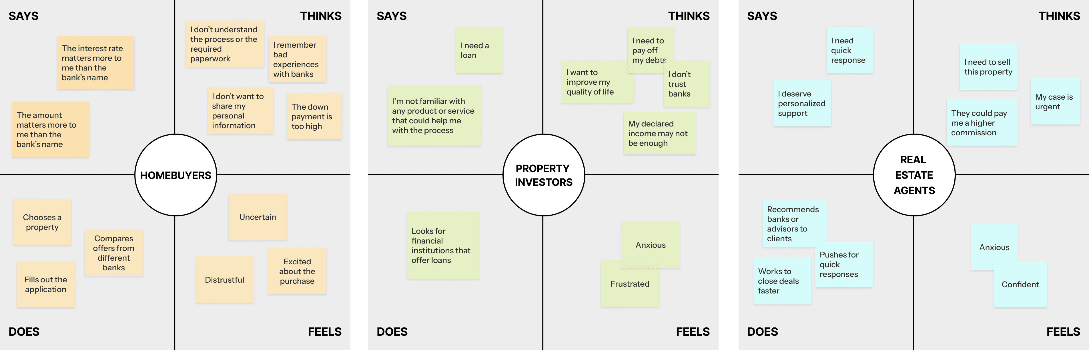
Empathy map for each user type. Click to expand.
The Problem
The service depended on slow, manual processes. Buyers and agents had little visibility into what was happening and felt unsupported throughout the journey. Meanwhile, the internal team was overwhelmed, making it impossible to operate efficiently or scale the product.
The Solution
I planned an end-to-end solution designed to work at different levels for all stakeholders.
A website for buyers to learn about the service and apply for a loan.
A landing page for real estate agents, focused on simplifying buyer referrals.
In both cases, applications flowed into a HubSpot system and workflow I designed for the Operations team.
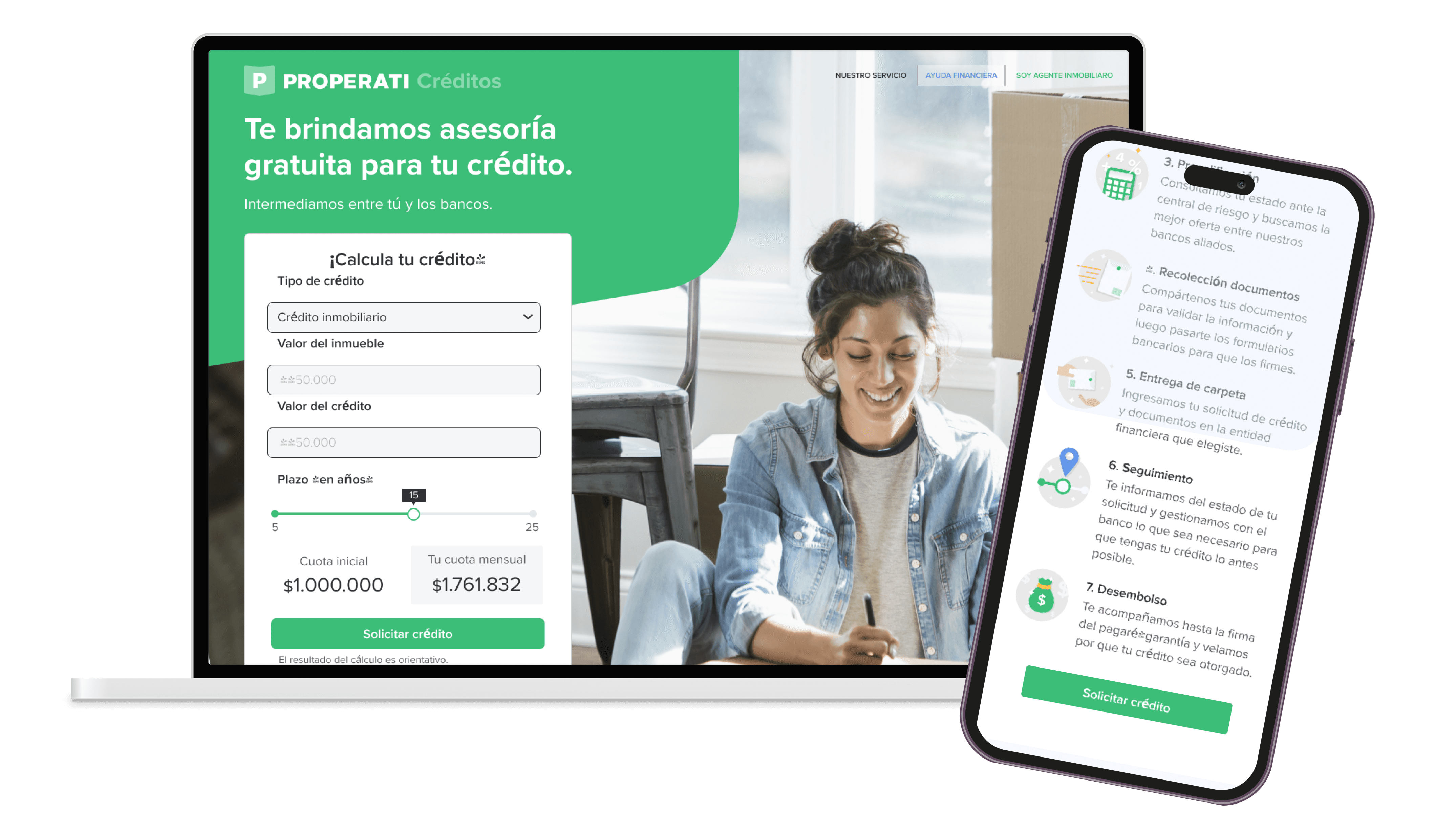
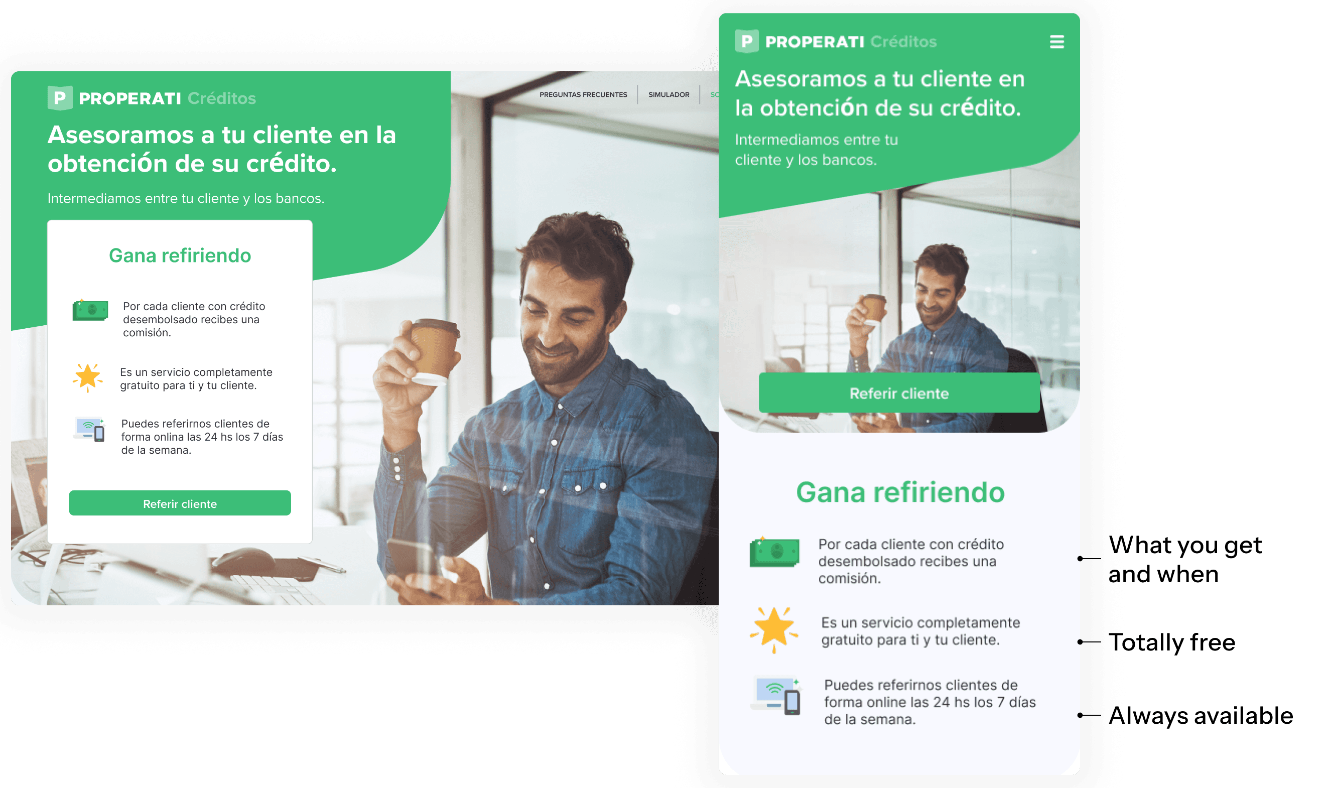
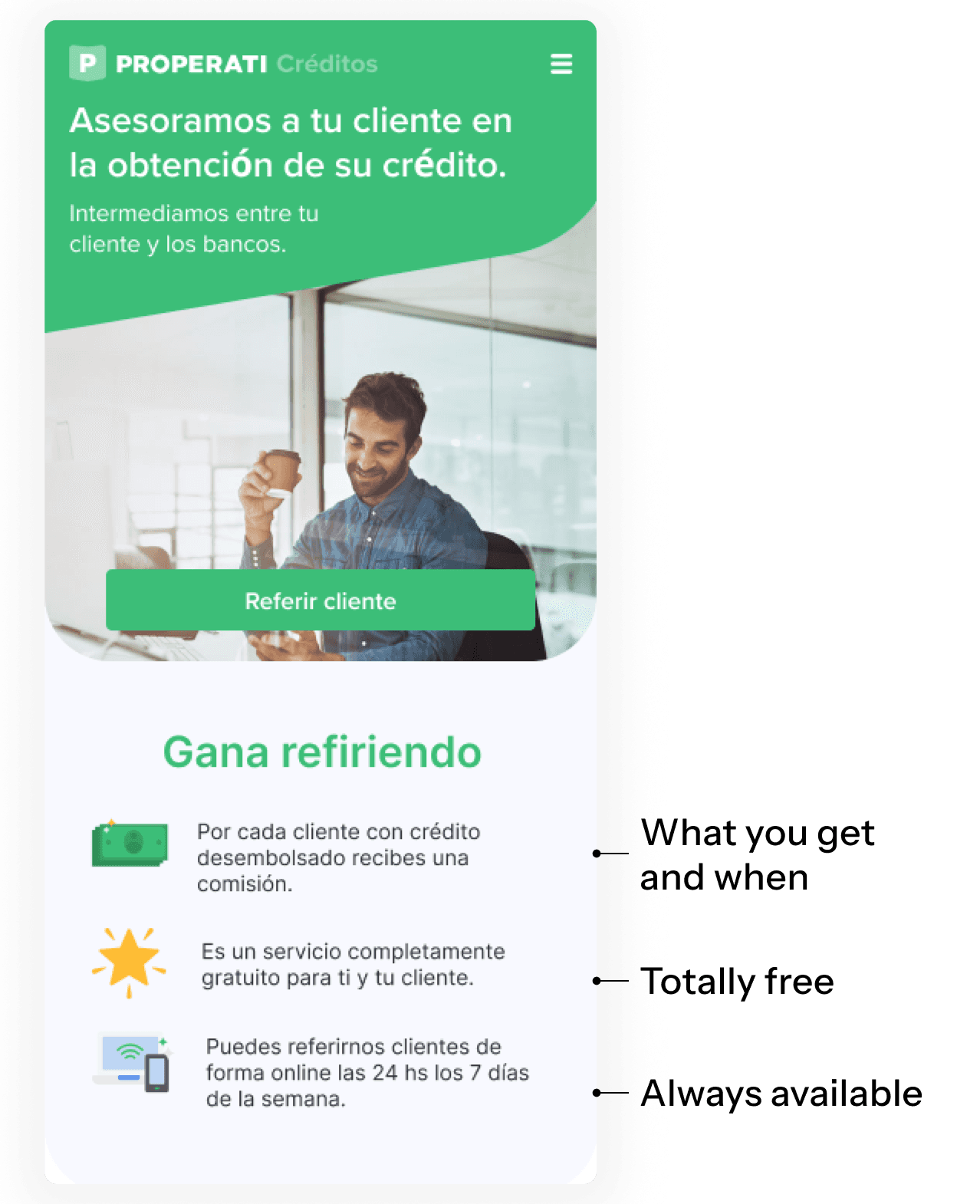
Landing for buyers
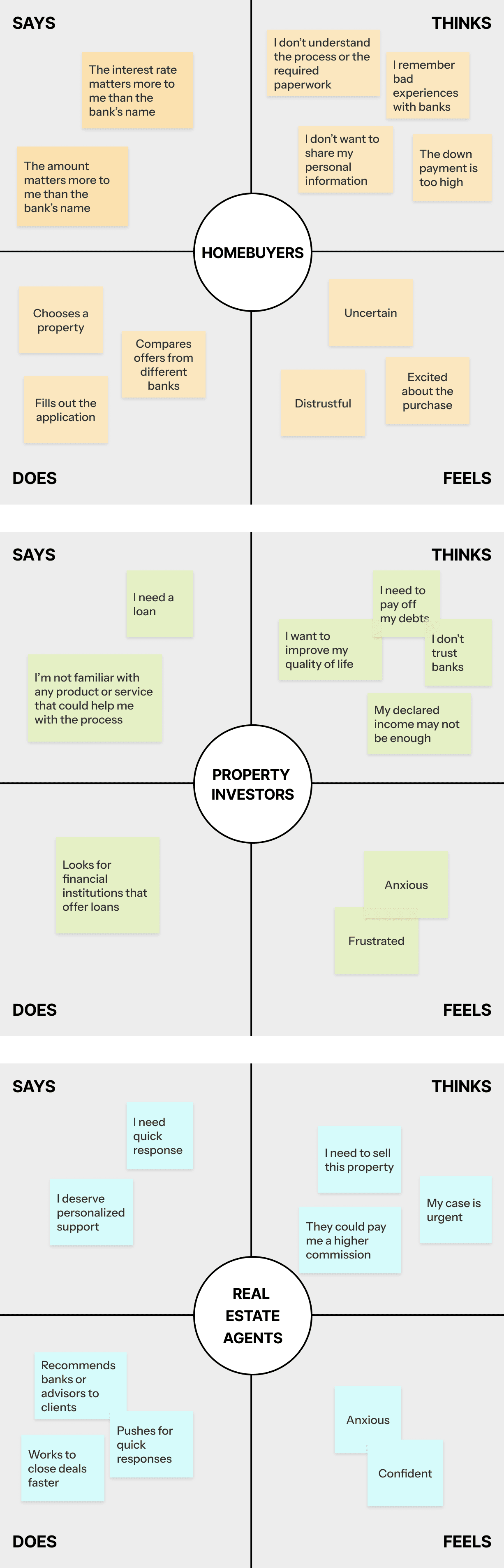
Research showed that buyers were mainly motivated by interest rates, how much they could afford, and understanding whether a loan was even possible. To support this, I designed a loan calculator as the main entry point to the experience. This allowed users to quickly explore scenarios and apply directly from the results.

Service blueprint for the Operations team
I created a flexible flow that combined automated and manual steps. This allowed loan operations specialists to receive applications in HubSpot and route each case based on its status: rejecting requests, presenting loan options and bank offers, and managing the process through to completion.
The service required multiple touchpoints, both email and phone. I designed these contact points across the flow and added automated and manual emails at key moments to clarify next steps, reduce anxiety, and improve transparency for both buyers and real estate agents.
Landing for Real Estate Agents
This audience cared about two main things: helping their buyers get approved quickly so deals could close faster, and earning commissions from successful referrals. For this reason, the agent landing page focused less on simulation and more on value and incentives.
Solutions aren't linear
After launch, we started tracking user behavior and I noticed a major issue: a large percentage of users were abandoning the form before completing it. Some were spending more than a minute on certain steps without moving forward, and we were often losing them before capturing any usable lead data.
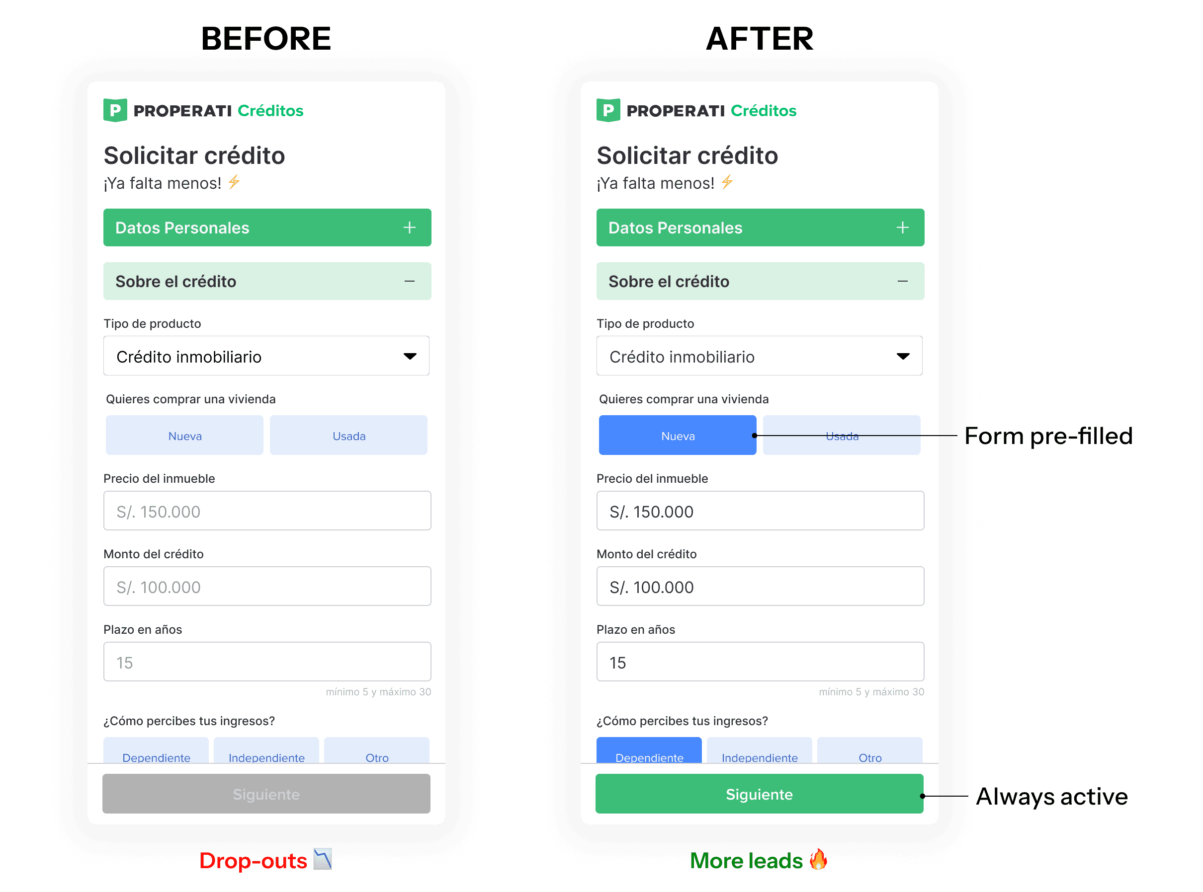
I met with the full team (engineering, product, and operations) to analyze what was happening. Our main hypothesis was that the flow was creating too much friction: too many steps, and a “Next” button that only activated once everything was completed. Even with error states, users were likely unsure about what was missing or blocking them.
Since lead volume was still within what the team could handle, I proposed changing the flow to a pre-filled form with an always-active primary action. This meant that even if users submitted incomplete or incorrect information, we could still capture the lead, contact them, and complete the details with human support. This shift reduced drop-offs and significantly increased the number of leads.
Results & Learnings
Each customer service agent could now handle 5× more clients.
Positive feedback from agents, buyers, and the internal team.
This project taught me that a lot of times to fix the user experience we need to also redesign the service behind it.


