RAFA.AI
Turning Complex Ticker Data into Intuitive Insights for Investors
2025
Product Designer
Introduction

What shaped my approach
Our target users are experienced investors, , but even experts shouldn’t deal with cognitive overload. The goal was to show valuable AI insights clearly, while handling the unique data needs of stocks, ETFs, and crypto.
And doing all of this without much user feedback or testing data to guide decisions, since RAFA was still in its early stages. I had to rely on best practices, stakeholder input, competitor research, and my experience with data-heavy products.
Simplifying the data, keeping the value
I approached the screen as a puzzle: modular cards that could be opened to show more information. This matched the rest of the UI and made the layout more flexible.
I knew the information had to be comprehensive, but how could I present it in a way that didn’t feel overwhelming?
The data needed to be thorough, but not overwhelming. To show how I tackled that, I’ll walk through some examples:
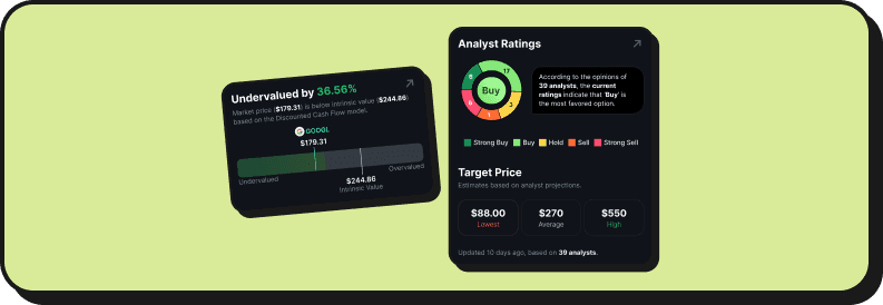
"Intrinsic Value"

For this case, I needed to design a graph that could show users how a ticker was valued based on the Discounted Cash Flow Model.
We had two key values:
Market Value
"Intrinsic" Value
Depending on the relationship between them, we had three scenarios:
Market > Intrinsic → Overvalued
Market < Intrinsic → Undervalued
Market = Intrinsic → Fairly Valued
And for Overvalued or Undervalued, the difference could be minor (0.2%) or major (88%) — which mattered.
My first approach was to make the conclusion the title, keep the explanation simple, and support it with a graph.

After conversations with the team, I improved the component by adding stronger visual cues to help communicate the insight more clearly, without depending too much on the description.

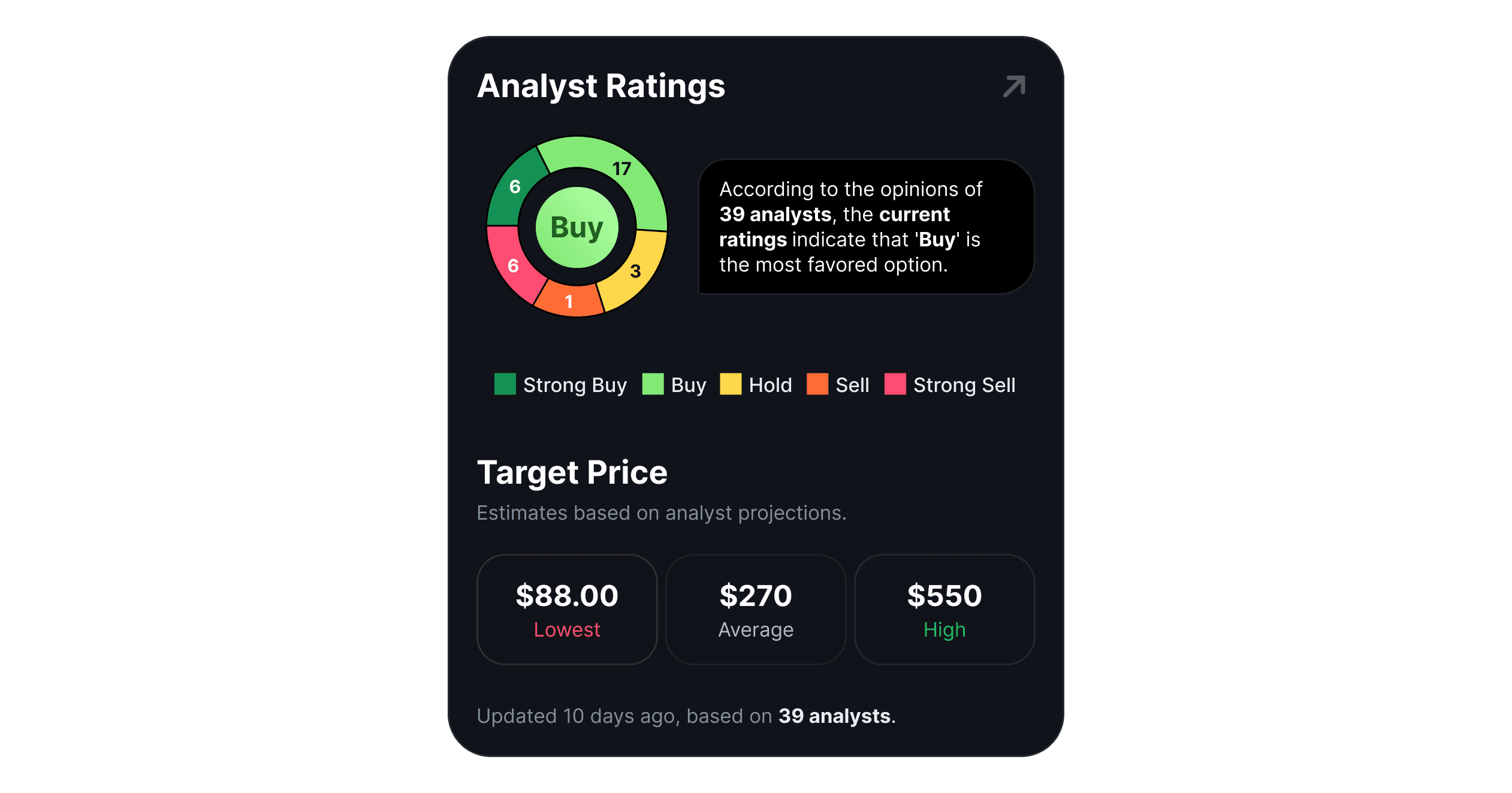
"Analyst Targets"

This card started from a rough sketch by the Product Owner. Other cards came from old designs or loose ideas—but they all had to come together into one clear, unified system.
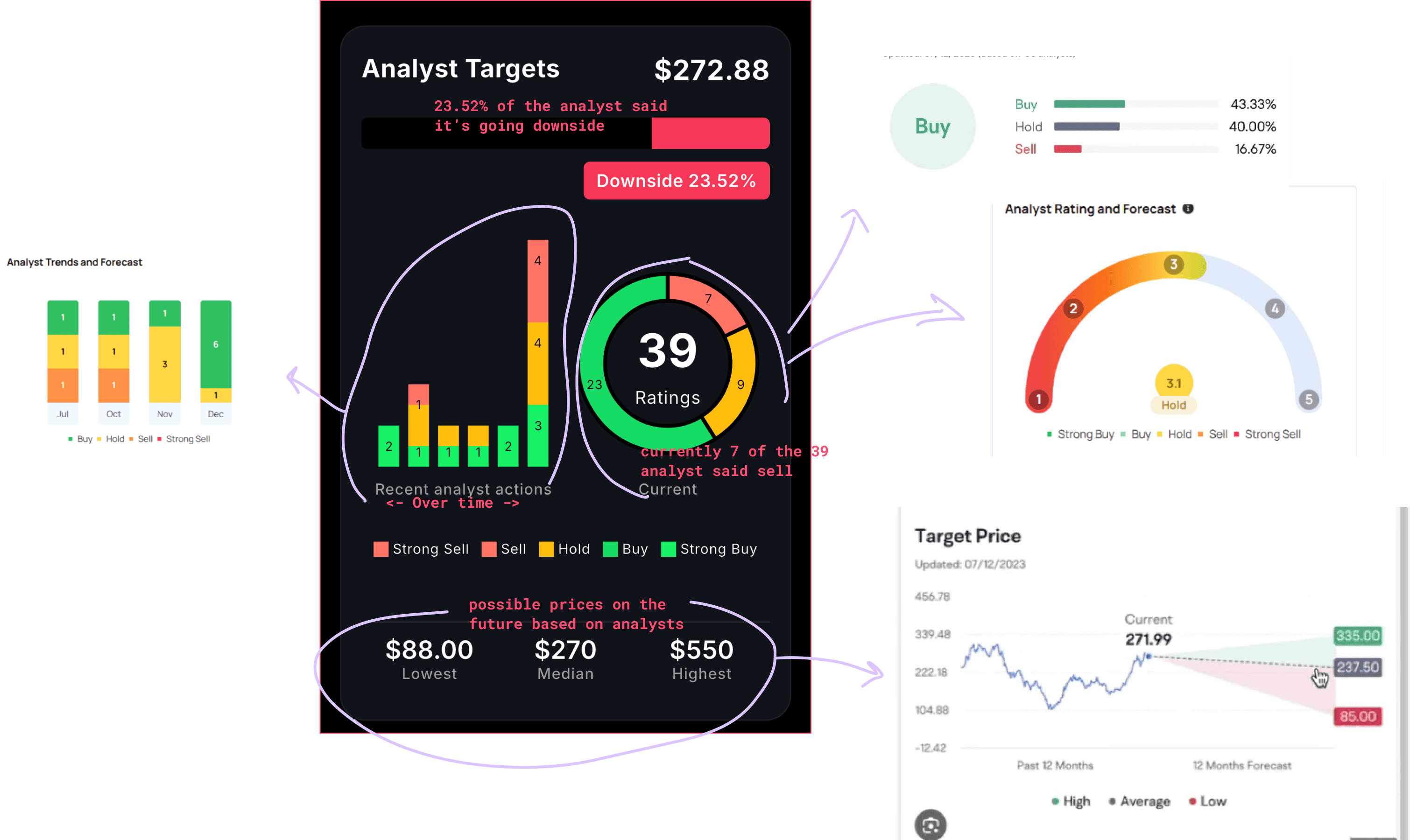
In the center is the sketch the PO made, and floating around are the notes I took.
After note taking, stakeholders interviews and some good old competitors research I set the goals for this card:
Quickly assess market sentiment from analysts.
Show trend changes (more buys/sells over time).
Compare current price vs. price targets.
Use price targets to set their own risk/reward strategy.
I sketched a solution, checked with Stakeholders…
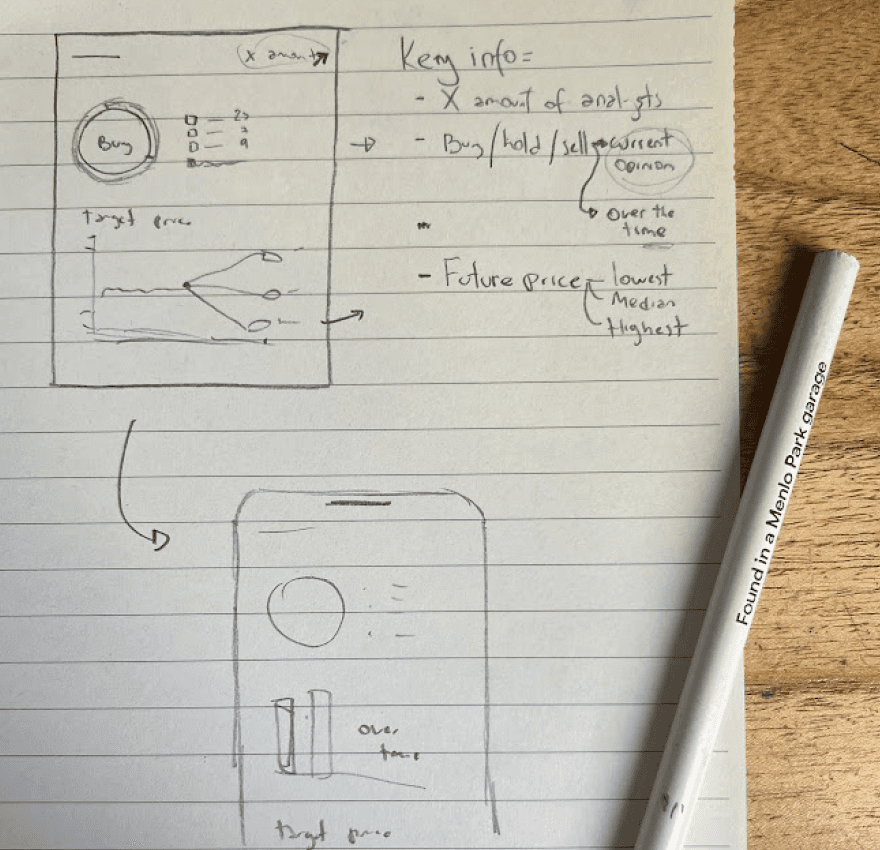
And then took it to Figma to work with our Design System.
Measuring success
We started without solid user data, building from a hypothesis — so the best next step is to measure and see if users are actually benefiting from the feature.
I suggested tracking a few key interactions for quantitative insights:
Interactions with Tickers
Time spent inside Ticker Analysis
Interactions with cards
Conversations with AI Agents started from the Ticker Analysis
Later on, we could run a few interviews to gather qualitative feedback. And as always, keeping an eye on support messages.
The takeaway
The project challenged me to think about how design could support decision-making in real-world scenarios. The right design can help users process massive amounts of data without feeling overwhelmed.
I also learned to be comfortable with uncertainty—without direct user feedback, I had to trust my design instincts and my knowledge of the target audience.
Above all, it reinforced something I already knew: it’s not about dumbing down the data—it’s about finding ways to present it clearly.