BUILD's FamBiz CEO Simulation. Comcast NBCUniversal.
Turning Disconnected Outcomes into Clear Feedback
2023
UX/UI Designer
Gettin On Board
I joined this project after it had already started. It was a fun challenge to understand everything, catch the style, and get on board. One of my tasks during my time here was to improve the usability in various areas of the game.
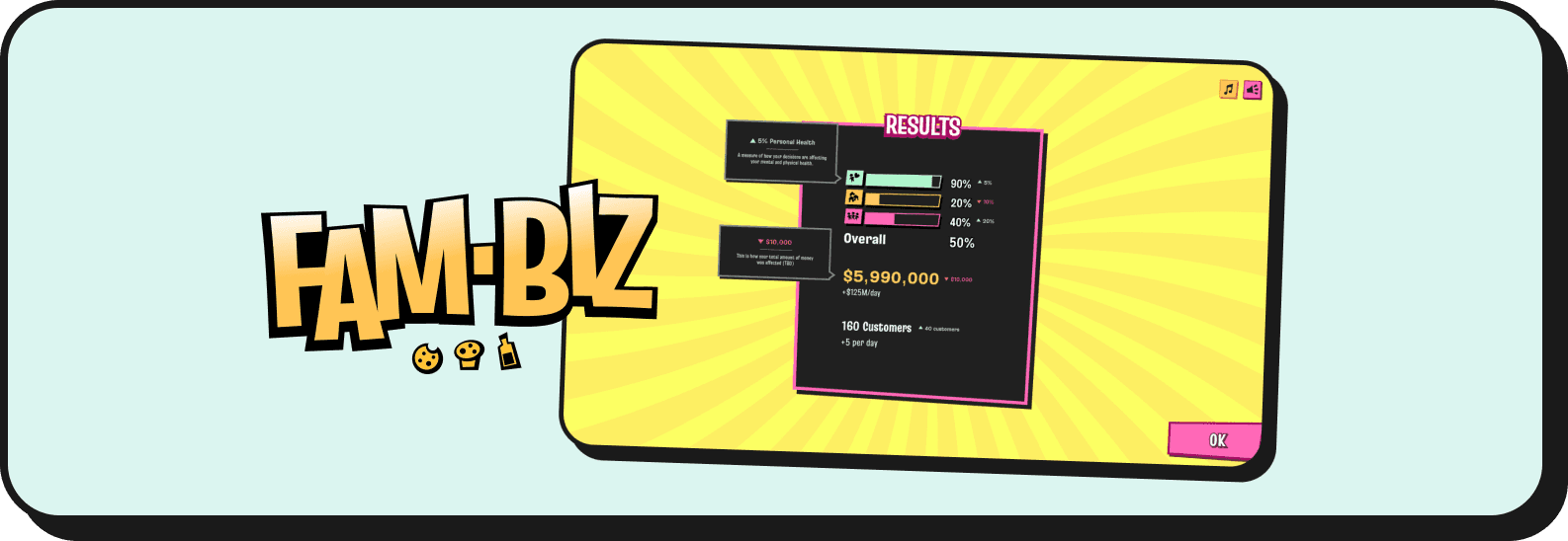
In this post, I’ll tell you about how I changed the results page to make it more intuitive.
Project Context
I worked as a Product Designer on a project for BUILD.org, a 25-year American industry leader in youth entrepreneurship education, which partnered with Comcast NBCUniversal to create BUILD’s FamBiz CEO Simulation Game.
It’s a free and educator-led entrepreneurship simulation game for students in grades 7-12, introducing youth to the fundamental skills and mindsets they need to lead in school and in life.
The Game
The game follows the structure of a choice-based system. Users have a general Dashboard where they can view metrics of a Cookie Factory they are managing. From the Dashboard, they access various challenges.
The challenges follow a classic interactive story structure. The player is presented with a dilemma or opportunity from a character, such as a “client,” “coworker,” or “friend.” They are given different options to respond to the situation, and after choosing one, they receive a response from the character and feedback on their decision.
The outcome of that decision affects their metrics, which is then displayed on a “Results” screen, showing how their choice impacted the game.
Darshboard
Dilemma/
Opportunity
Options
Response
& Feedback
Results
Challenge structure from Dashboard to Results.
The Problem
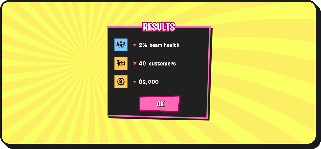
The “Results” screen, rather than helping, was actually confusing for both students and educators. Upon reviewing the design, I noticed that there was no clear connection between the results at the end of the challenge and the metrics on the dashboard, making it difficult to relate the changes to the metrics.
Original Results screen showing a list of the changes that the selected choice generated.
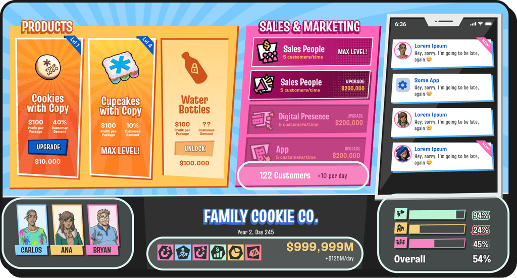
The dashboard screen, highlighted are the places where the results impact.
Players can’t see the Results and the Dashboard at the same time, so relating these two screens requires them to remember the icons, the meaning of each metric, and their current values.
Ideation
💡 It’s very interesting to work on an educational game as both a Designer and an Educator. In these cases, usability goes hand in hand with learning. The user experience needs to be intuitive, but also educational.
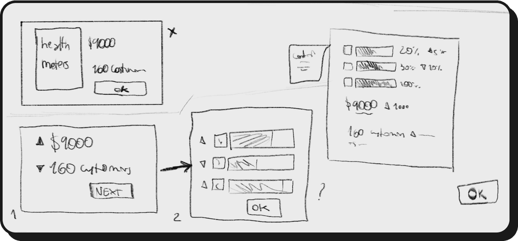
Some beautiful wireframes I created during my process.
Solution
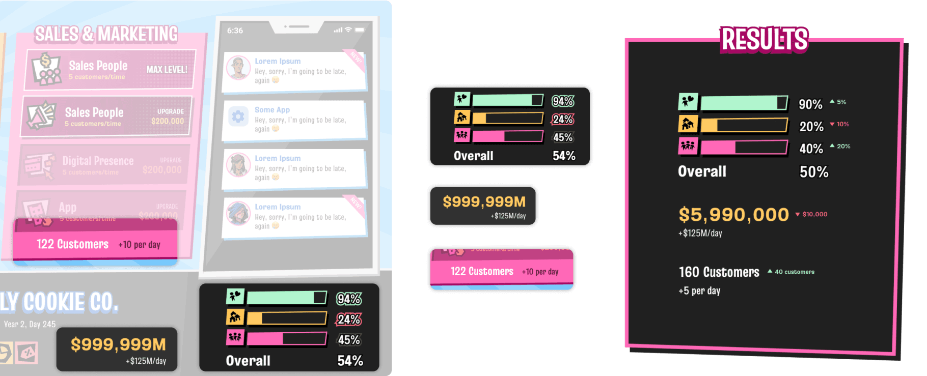
Creating a visual connection between the Metrics on the Dashboard and the Results.
Adding animations to clearly show how the metric values change.
This allows users to see their current metrics and how they were affected by the choices made during the challenge
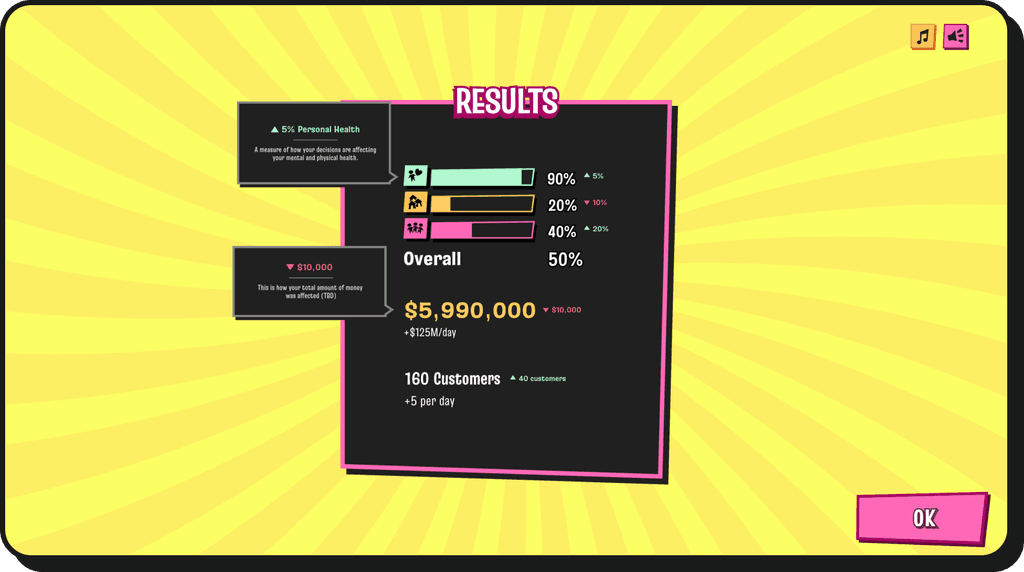
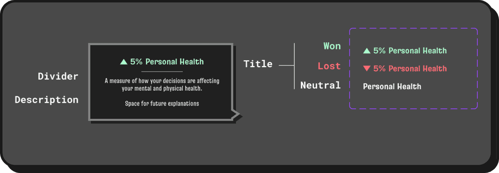
Introducing tooltips with space for context and explanation of the consequences.
Although the metrics are visually related to the dashboard, there is still a lot to remember. With tooltips on both the dashboard and the results, users can check the meaning of each metric whenever they need to.
Documentation
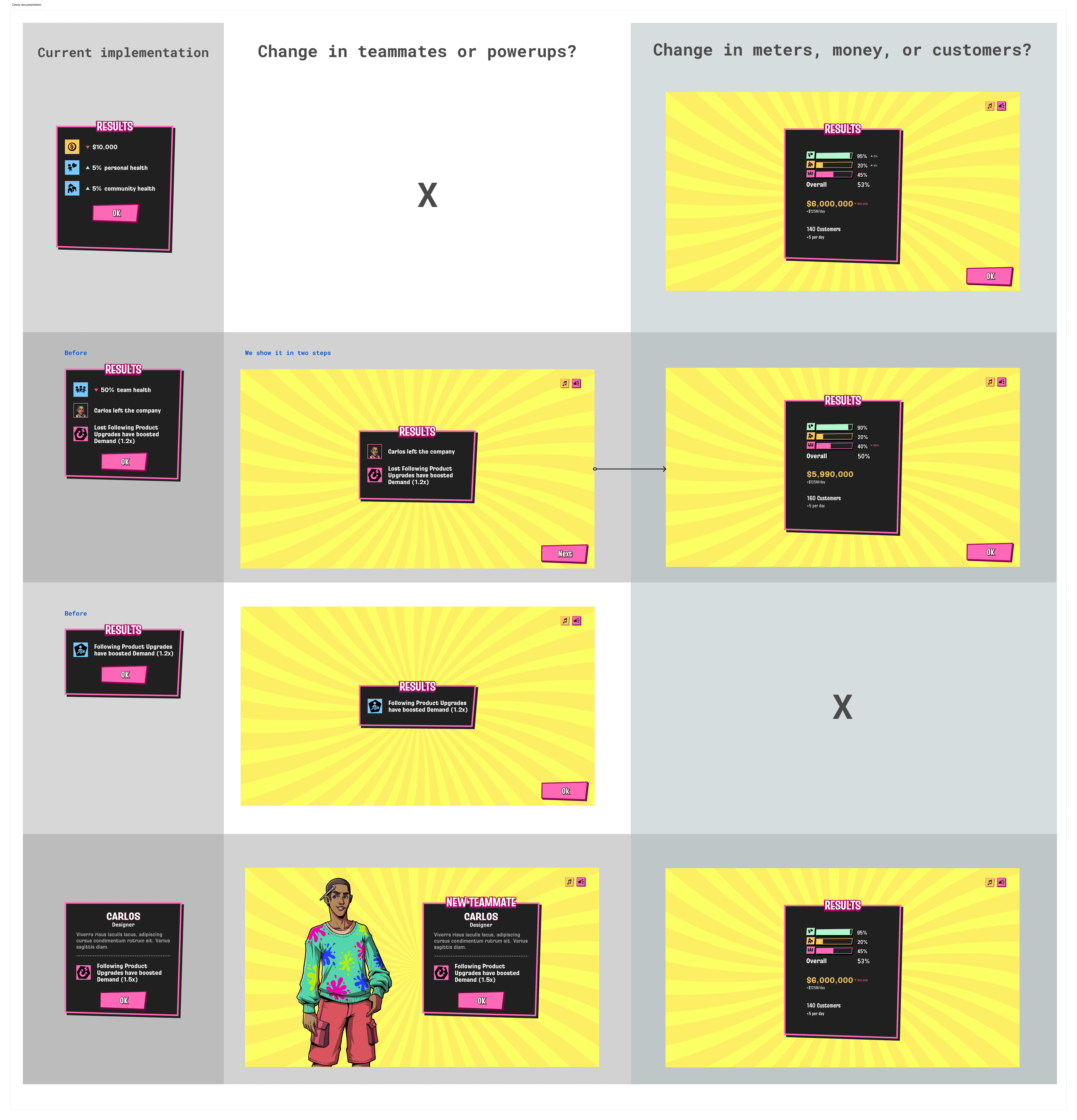
To assist the developers and ensure a smoother hand-off, I documented the changes made to the screen and their possible cases.
Mentions
Working with BUILD's team was an amazing experience.
During this project, I had the honor of working with Karulox, a creative and hard-working 2D artist. Check his work here.
Everything designed—from user experience to game logic—before I joined was created by Pablo Artee, an amazing Product Designer I’ve worked with. Check his work here.
